As our name suggests, New Narrative exists to help companies tell their stories. Given the fundamental importance of data in decision-making, anyone seeking to tell a convincing story must grapple with three data-related challenges: aggregating it from different channels and sources, translating and analysing it, and presenting it in an understandable – and influential – way.
Since staring at spreadsheets is no fun for most people, the third of these is perhaps the most important to get your point across. Visually transforming numbers into easy-to-understand charts, or other graphical formats, is crucial to allow you to capture and highlight key insights and present these effectively.
While most of us have likely had some degree of experience with visualising data, many probably haven’t considered its importance in much detail. So in these blogs I will set out some fundamental considerations that will help maximise the impact of your next data-driven narrative – as well as give some tips on how this applies for B2B marketers, and suggest some tools that you might find useful.
Basic principles of effective data visualisation
In the 20th century, the advancement of science and the increased use of statistical data required a scientific and systematic approach. Edward Tufte, an American statistician, is credited as the father of modern data visualisation and information design. His book, The Visual Display of Quantitative Information has become an academic and industry standard on the theory and application of statistical graphics, charts, and tables.
Fig.1 Edward Tufte's Visual Display of Quantitative Information, Pg. 72
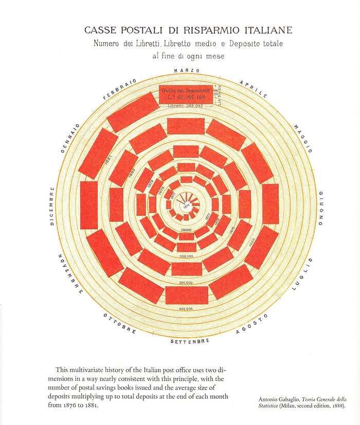
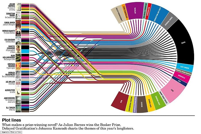
One important lesson Tufte taught is that more (and more complicated) data does not necessarily require more visual elements to display. Tufte coined the term chartjunk to describe the use of unnecessary, confusing, and complex visual and formatting elements such as 3D imagery, obscuring annotations, and inappropriate font types, that serve no practical purpose but result in a crowded and “busy” visualisation.
Fig.2 Chartjunk and why to avoid them, BusinessQ

Fig.3 Can information be beautiful when information doesn't exist, Junkcharts
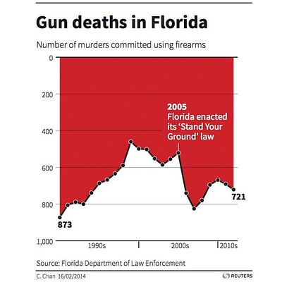
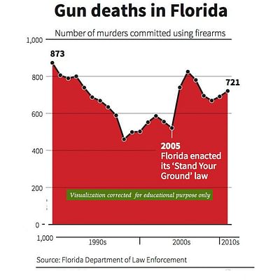
Chartjunk can also result in data misrepresentation, by manipulating scales and other elements to mislead the audience and thereby skew conclusions or insights. Sadly, this has become all too common today.
Fig.4. Gun deaths vs ‘stand your ground’, Misleading Data Visualization – how to avoid them? Management Weekly.
Misleading
Clear
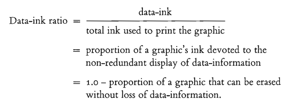
An important related concept Tufte invented is the data-ink ratio, which can be explained as any additional “ink” in the form of labels, colours, annotations and axes that add no useful context or information to the visualisation. The key is to get this as close to 1 as possible, meaning that if you have included all the data available, you should get rid of anything else.
Fig.5. Data-ink ratio, Infowiz Wiki
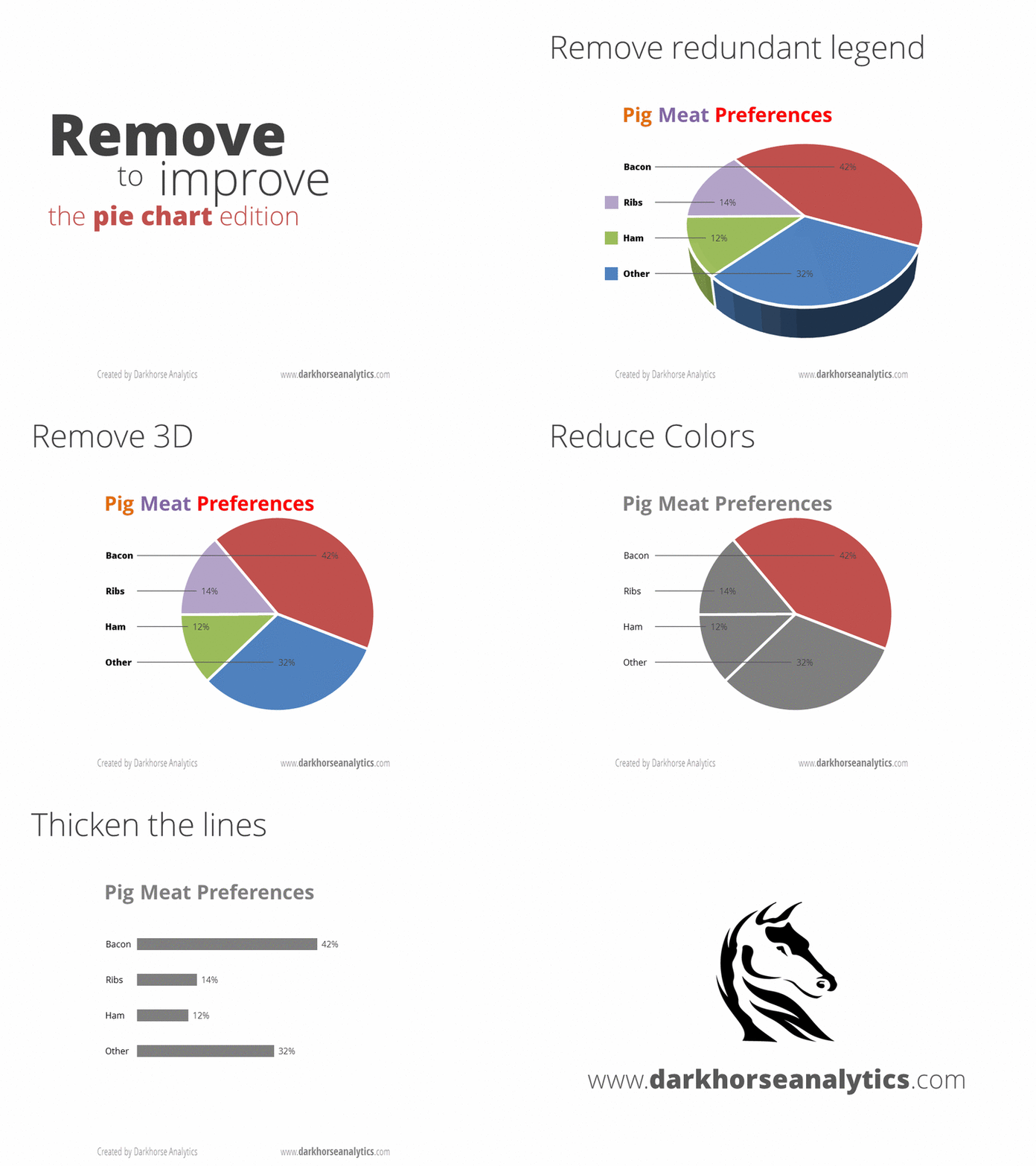
This animated clip from DarkHorse Analytics demonstrates how a badly created data visualisation can be improved by optimising the data-ink ratio.
Fig.6. Data looks better naked, DarkHorse Analytics
From visualisation to insight
In practical terms, this means that the scope and quality of insights can be massively improved just by selecting the right kind of data visualisation.
That needn’t mean forgoing innovation, of course. Consider candlestick charts, originally developed in the 18th century by a Japanese rice trader. These were used to keep track of daily rice exchange prices and have since been widely used by financial market analysts, to visually represent a stock or a market’s daily activity. Candlestick charts were novel since they allowed traders to understand at a glance how a specific market or financial instrument performed over time, in a single visual character that showed the open, high, low, and closing prices.
Moreover, candlestick chart patterns, a combination of several data points, have since been used to predict a particular market movement, such as the Hanging Man pattern, believed to indicate the top of an extended uptrend before reversal, or the Hammer, signalling a potential uptrend following a period of heavy selling.
Fig. 7. Candlestick chart patterns, Axi
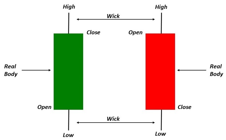
Fig. 8. Hammer and Hanging Man candlestick patterns, DayTradeTheWorld

And there’s no doubt that data visualisation done right can be as breathtaking as art: before examining some practical applications, I’d like to share my favourite data visualisations that achieve this, by the award-winning data visualisation designer and artist Nadieh Bremer. With a background in astronomy, data science and analytics, Bremer develops visualisations for a range of corporations, business and professional organisations. I first discovered her work on social media; her website Visual Cinnamon is home to both her professional work and a collection of data art projects - including some of my favourites inspired by her science background.
Fig. 9. Anhedra by Nadieh Bremer, inspired by the process through which minerals (and rocks) are created.

Fig. 10. OECD Global Plastics Outlook by Nadieh Bremer, visualising the flow of plastics in 2019 and how it would grow to 2060.
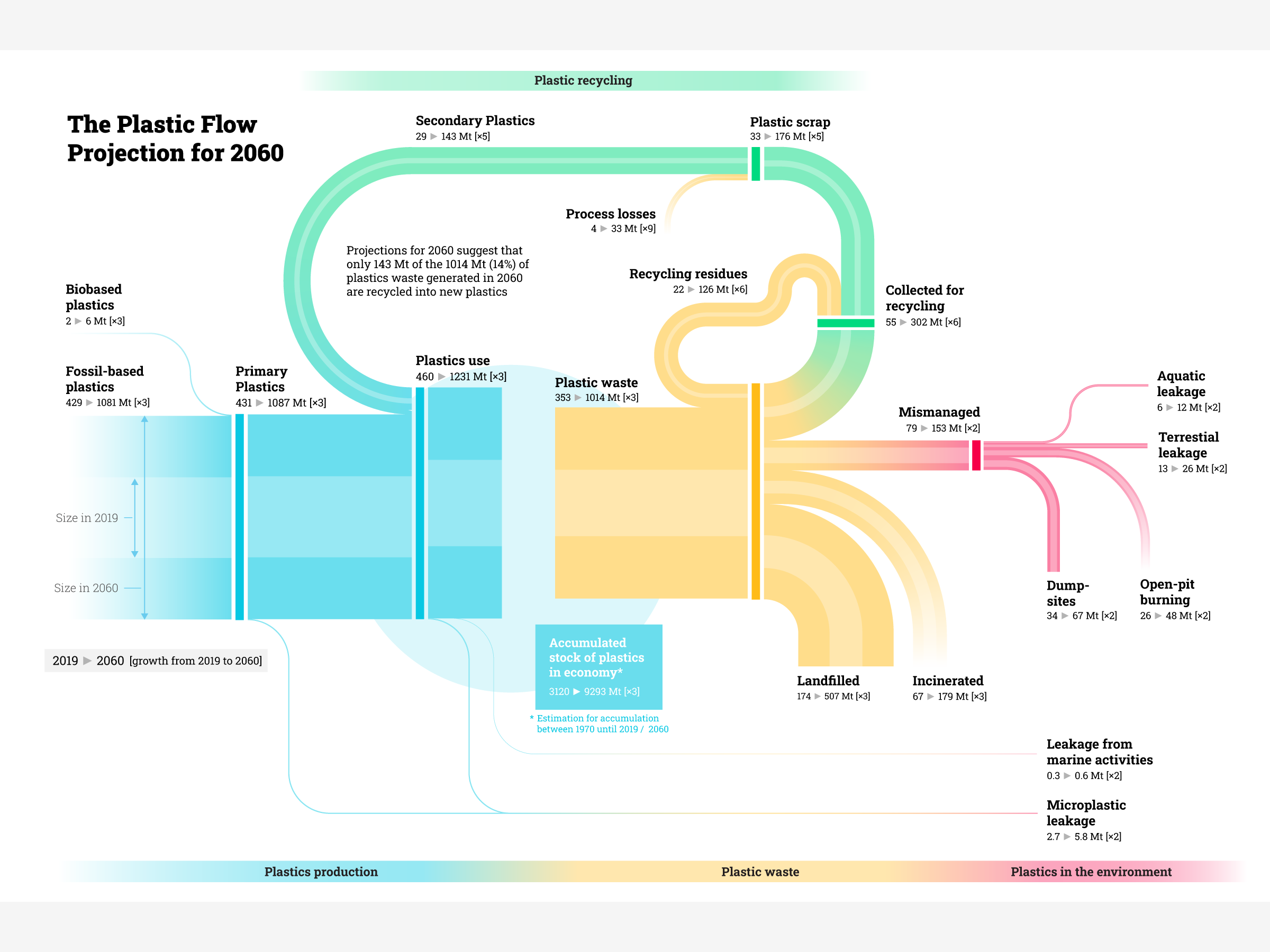
Fig. 11. Space Wars by Nadieh Bremer, visualisation of all the satellites that are still active in space.
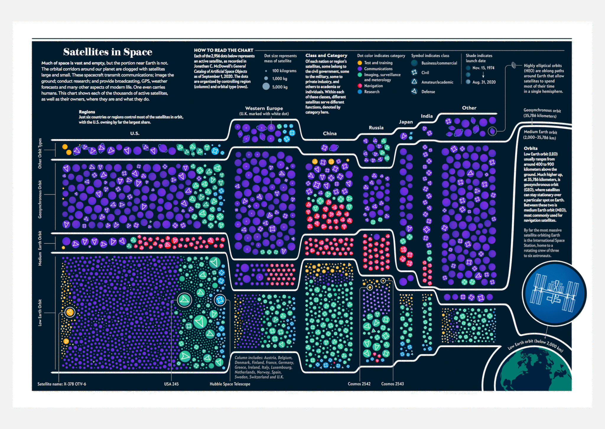
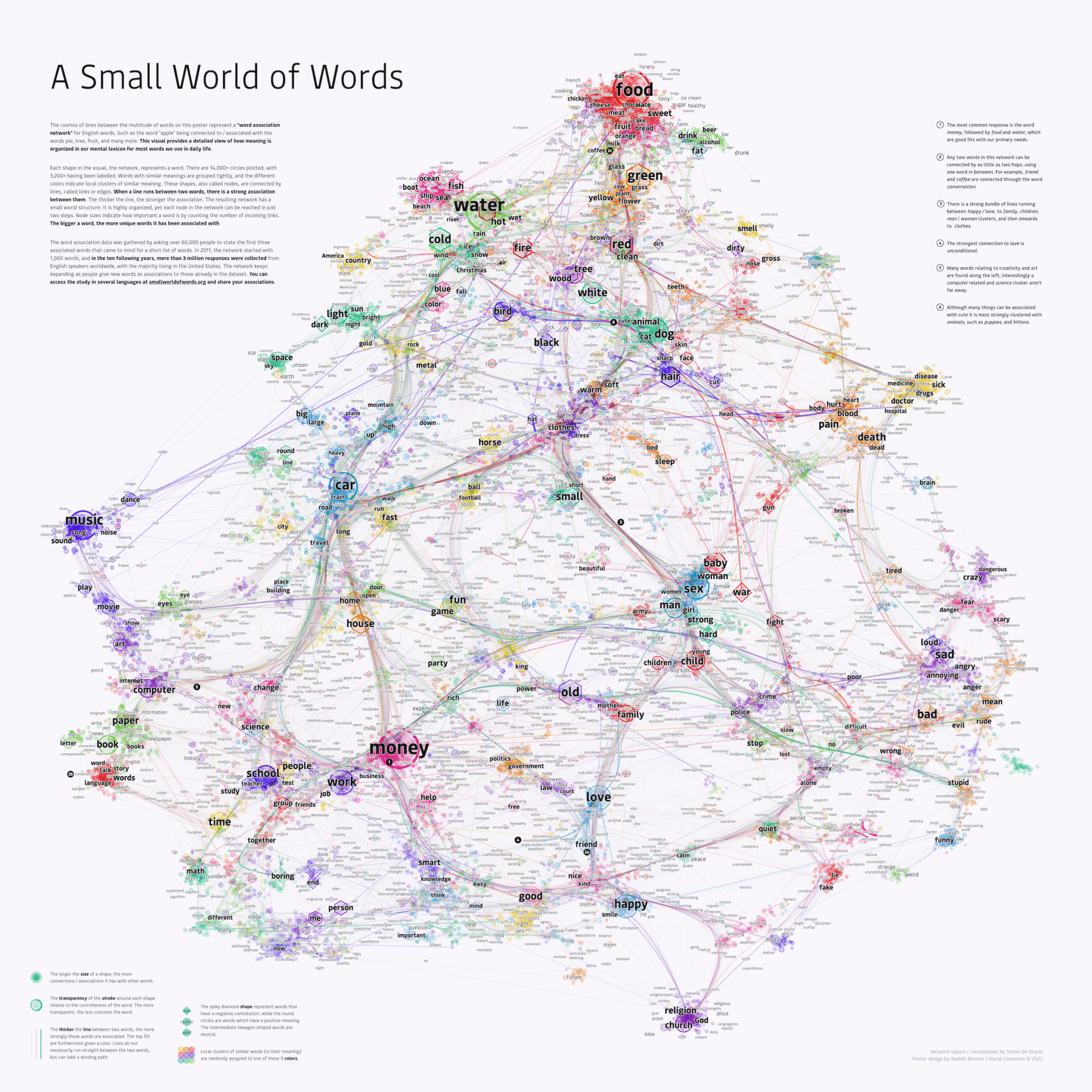
Fig. 12. Small World of Words by Nadieh Bremer, visualising how people associate words.
In Part 2 I look at what practical lessons marketers in particular should take from these broad principles, and how specific tools might help you turn your data into a clear, new narrative.
World-class communications strategy and execution
Contact us to get started